Saturday, August 23, 2008

╠ Cadbury - Trucks ╣

This week it was a real tussle for who would win the poll. It was really good to see despite a few less overall votes, but I blame that on the nothing new aspect of it. None the less by the end a winner did appear in that of Cadbury's Trucks ad. Overall in retrospect I think perhaps I should have considered there being problem with critiquing two ads from the same campaign, but none the less since it is what was voted for I shall continue on. To those of you who missed the gorilla breakdown, it can be found here.

╠ Cadbury - Gorilla ╣

Anyway, on with the show!


To those of you who read the Gorilla break down you'll not that I pointed out that despite completely being irrelevant to chocolate it was still very effective in my mind. This obviously applies to this advertisement as well. The reason this works is because of chocolate by nature is an impulse buy. I mean it is possible that you will purposefully go out to seek chocolate, but for the most part it will be an unanticipated purchase. It is notable in chocolate adds that there isn't a lot of variance. From my experience there are in majority two types. The first is the one focusing on the chocolate in particular and trying to convince you that somehow eating this particular bar of chocolate will make you so happy that you'll almost have an orgasm from it...perhaps a bit over the top but I'm assuming you can at least picture the sort of ad I am referring to. The second is the one that simply spams the brand. For the most part I only remember Cadbury doing that...However they are also sort of have a huge monopoly on the whole thing meaning that have the money to put into such things

This ad comes into the second type. However it takes a more passive approach than the usual 'Wouldn't it be nice if the world was cadbury' ads. Like the Gorilla ad it introduces the cadbury element at the start and then has something random and finishes with the same ending. I think the reason this was less successful may simply be because whilst it is quite amusing, I don't think it had the same potential to spread as viral as the Gorilla ad did. If you think about it as a youtuber type individual I think you're far more likely to pass on a Gorilla playing the drums than a range of trucks having a race.

That being said there are other elements of this ad I do appreciate above that of the Gorilla ad. It is far more clever with it's use of it's special trademarked purple colour. They didn't simply take the lazy way out and just use the one car that was purple, they thought about a few more uses Eg. The sky and the lights underneath the baggage carrier.

Personally I find the music very suiting for this clip and the tagline overall because it successfully ties into both what you're seeing as well as the glass and a half of joy tagline with the having a good time build up. I think it works well with building up a feeling of enjoyment because the race looks like a lot of fun. I think the unconventionality of it works well as well since the different trucks give the overall race a unique and different feel. Which I find clever because unique links to new, which goes well since it is the launch of a new tagline.

Overall I think this ad works quite well. There are a lot of good elements at work. I think it was never built to be quite as big ats the gorilla ad though and instead to simply be something to help capture a larger audience when paired as opposed to being in direct competition with it.

Sorry for not being able to say too much about this ad, however it is simpy in retrospect that I realize half the things I could say ave already been said for the Gorilla ad. Also sorry for the lateness but it's just been one of those weeks with no real free time whatsoever. In fact I haven't been alone at home pretty much since the poll ended.

Anyway for this week I have come up with three new options for ads to break down. There is Daniel's Birthday which is a Mitsubishi Pajero Ad. There is Sony, all eyes on you which was made to promote the Vaio laptop and finally the Commonwealth Bank ad with the Dollarmite remake which reinforces the Determined to be different line.

I hope you all enjoyed this breakdown and as usual comments are all too welcome.

Monday, August 18, 2008

╠ Comic - Can Sex Unsell Sex? ╣

I had a good idea for this comic so I felt like getting into it right away. I didn't get many comments on the Bonds ad so I hope that's not because I got it totally wrong. Also if any of you have recommendations for ads I think I'm getting to the stage where I sorely need them since voting this week seems to have stagnated because of it.

As for this comic. If anything it made me realize how much I struggle at drawing girls. In the end I just had to give up for the final frame and trace them from a bonds website. Quite sad really. but hopefully one day I'll be able to draw that well freehand.

As usual I hope you enjoy the comic and comments are always welcome.

Saturday, August 16, 2008

╠ Bonds - Hi and Lo ╣

Despite ending up with the ad I felt I knew the least about as the clear winner with 9 of 11 votes I feel quite good about how this is all going. In a way I am actually proud to have to delve into the one I felt I would be the weakest on for experience sake. Also to get over 10 votes really just blew my mind. I really didn't expect to get that high within months of starting this so to break 10 on the second poll is just instant win. I really do have to thank those that have helped me with this, Kibble for looking over my comics before I submit them, Zac who as a marketing blogger himself has been very helpful and also inspirational to a newbie such as myself and of course Rachael who basically is the reason for this blog to start and even the one behind the idea of including comics. Also to anyone else who has helped along the way or left comments, thankyou.
Now onto the semi naked women! (Not a line I thought I'd ever say)

Bonds - Hi and Lo


First off I have to point out I didn't realize how many close up bum shots there were in these sorts of ads. I'm currently on capped internet so Youtube stops to continue loading and the amount of times it stops simply on a rear is quite amazing...

The reason I was first worried about beaking down this ad was because I was thinking of it as a single ad and not thinking about the background behind it. Bonds has a history with ads that are outside the norm and there is a very good reason for this.

If you think about the ads in a different light and think about what other people have done when it comes to underwear ads and you find the options are pretty limited. It's usually either something saying 'These are the most comfortable underwear that you will ever wear' or 'wear this and your chances of having sex will go up'. The first option sort of works at first but wears off through peoples lives once they realize that underwear in itself don't really vary that much comfort wise. No matter which underwear you get odds are you'll face moments of discomfort since by nature underwear is about confining sensitive areas. As for the latter, the problem with this is that first off how gullible do you have to be in order to believe that underwear will be the decider for if someone has sex with you. Personally I think if you find a way to show your underwear before the decision is made then you've probably done something wrong.

Another point of these sexy underwear ads is that they're marketed to the opposite gender in the sense that you should buy it for your significant other. The issue with this is that I'm not sure about other males but I personally don't see myself as the type to buy ladies lingerie, first because of the looks I would get at the counter and second because I'm not the same up there and down there so I wouldn't have the confidence to enforce that this is the right underwear for her. Then there's the issue of girls buying for males. This I have less insight on but I believe it isn't that effective either because the main fact is that men don't care about their underwear that much. You could buy them some nice and shiny underwear for them, but they'd be just as happy with a pair of kmarts. I believe women by nature are more rational with such decisions so they wouldn't be able to justify spending the extra bit to just make their special man friend that little bit specialler.

So when it comes down to having just these options then you can understand where Bonds is coming from. Simply trying to advertise underwear without sticking to the old cliches. For those of you who haven't seen the ads predating this one here's some that I managed to struggle my way to on my capped internet


Mash


I like this ad because it manages to get the cliches across while still being different. They're doing all different types of dances thus promoting the versatility that the underwear can remain comfortable through. Also they chose nice looking girls enforcing the sexy bit as well. But all this is subliminal. All you're seeing is girls enjoying being in their underwear.

Kaleidoscope


Another add enforcing the versatility whilst comfort remains and again with cute girls. However again all you see is girls enjoying themselves in their underwear. The clever bit of this ad though is the last second. It just looks like an off hand shot outside of the normal ad however it ads show much because it reinforces just how much fun these girls are having in their underwear, hitting all of the subliminal notes hard.

Davenport - Pie Fight


Now this one isn't actually Bonds and I actually spent ages looking for it because I thought it actually was Bonds and it was the one that I remembered best out of all of them. Much to my surprise I found out it was a Davenport ad. Bonds seems to have put such a monopoly on out there underwear ads that the one I remembered best out of all of them was attributed to them. This ad shows how Bonds have improved on an ad such as this by having Bonds big and bold on every bit of underwear. This is a perfect example of the impotance of labelling your products.

Now back onto Hi and Lo. The reason this ad works is because of the WTF factor that everyone is so confused about. You hear the scream at the start and then are simply glued to the screen wondering about what exactly you are watching. The power in this is that your mind is more active than for the average so whenever you see the Bonds tag on the underwear it is absorbed directly in as opposed to being as easily ignored as some other messages. The bonds tag is in almost every shot so that's a lot of times you're absorbing the bonds name.

The reason why this is all importnat is because of brand awareness. Underwear at least for me is something that I don't get too emotionally involved in. I don't know who makes underwear. In fact when looking at the davenport ad I was like 'Oh right, they do make underwear'. People are more inclined to purchase something from the brand name most prominant in their mind. This is because of the mindset that we assume that since we have heard more about it, the more worth hearing about it is.

So this is the conclusion I've come to. There's no secret meaning behind what they're doing apart from the obvious hi and lo connotation with the game they're playing. The true point behind this is so simply first off show that their underwear is comfortable considering they are able to do such an exerting activity in that underwear while not showing any discomfort. Secondly that the girls are nice looking so that you think you would be nice looking in them too. Then finally to spam the name bonds so that when you go underwear shopping Bonds is in your evoked set of main options you would consider when buying underwear. Personally next time I go underwear shopping...which as a male will probably be quite a while away, I will be considering Bonds, how about you?

I hope some of you found this at least a bit insightful and I hope I haven't overlooked anything. Also if any of you know of any ads you'd like to see broken down give me a buzz because this week is going to include losers from the previous weeks. The contenders this

Thursday, August 14, 2008

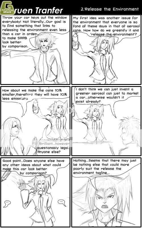
╠ Comic - Release the Environment ╣

I got some free time over the week so I was able to do the comic in order to catch up. So here is the comic linking to the SAAB - Release the Environment ad review. So now hopefully the comics will be posted on a weekly basis and linking to the ad I have just broken down. I'm pretty happy with the style at the moment so I think I'll keep it. Onto the comic...


I sort of didn't want to be so cynical about the ad because I don't overly hate it...but it isn't that easy to write these things and I think I have actually tried to paint Tannie as a ruthless marketer so it sort of fits. I do enjoy writing this sort of stuff though because it starts with a very limited option and then it's up to me to try and find a way to take it and alter it in order to try and spin a new comic out of it that still maintains some sense of humour.

Any critique is encouraged so that I know if there's anything that needs improving on. Also it looks like I'll have to break down the Bonds ad this weekend. I don't know why you all want me to study girls in underpants but it's what you asked for so it's what you'll get :P I'm just proud to have more votes this week than last week. Although I don't have any new ads to poll for next week so if anyone has any suggestions let me know and it may just end up in the poll.

Anyway I hope you enjoyed this and hope you check in again to see what works so well about girls in underpants.

Tuesday, August 12, 2008

╠ Comic - Welcome to Gruen ╣

As some of you may know I am quite the avid comic maker. So in order to try and augment my blog I am trialing a comic to go with it. I am aiming to do one a week and try to link it to an ad that I have just broken down. I have been trialling styles and the such and so far I am pretty happy with where I'm at but as usual any critique is welcome in order to make it as good as can be.

This comic is simply introducing Tannie and also linking to the Cadbury Gorilla ad that I broke down just over a week ago. Anyway I hope you enjoy and as usual I look forward to any comments you have.


Hopefully I'll be able to keep to one a week, although since I am sort of a week behind linking to ad wise I may try and put a rush on doing a comic linking to the SAAB ad. This stuff is really hard to think about now that I've gotten started :P But none the less I hope you enjoy this attempted humours addition to the Gruen Transfer

Friday, August 8, 2008

╠ SAAB - Release Me ╣

I must admit I was incredibly surprised to see votes in my poll in the first day. I was honestly expecting to have none for the entire week, so you can probably imagine my surprise to get 7. With 4 of those 7 votes the SAAB - Release Me ad was the winner...You people never want the simple ones explained do you :P

Also just to point out I worked on a logo this week and the G you can see in the header above is just that. Also the G to the side is an edit on that to see if attaching the logo of the groups I critique adds anything. Any opinion on either is well encouraged. Also to those of you wondering what the 'advertising space' means. The basic point is that in this world it's sort of interesting to see that just to what limits advertising can reach. You think of it, and there's advertising on it. My incorporation of this into my logo is saying in my semi artsy wankery way is that even Gruen Transfers personal logo is not exempt from advertising other brands. The point that the core logo and recognizable feature of something can itself include advertising for something else. I hope I explained it well, if you're still confused just hit me up with a comment. Anyway onto Release Me.


Overall I believe this ad is sort of good, however it just went a bit askew. I believe the build up is good. It really gets the point of nature being contained and wanting to be released. It has simply one point it wants to put out and it points it out again and again to make sure it is understood without being intrusive. Personally I felt some of the images made me almost feel sad for it. Paritcularly the whale and the dog slow motion bits I found to be effective. The lyrics were also very powerful in hitting this point home. Now it may just be the site I took the lyrics from but these lines don't actually line up in the song, they are split up. So it was these lines being specifically chosen as compared to just choosing a part of the song. Here is the lyrics in case you didn't understand them all.

I am a rolling wave without the motion
A glass of water longing for the ocean
I am the fire burning desperately but you're controlling me
Release me
Release me

The fire burning line actually breaks in when the dog is trying to break free and I believe that is the power moment of the ad. I believe that if you don't get the message here you may not be paying as much attention when viewing the ad, which when you think about how people view ads could be a vast majority, thus they later bring in the line across the screen that points it out especially that the power of nature wishes to be free. I really think up to this point the ad has worked really really well. Up to here I am really impressed...then the car appears.

I have to admit linking the car to this theme of releasing nature is a hard one, and I personally cannot think of how to do it better, however perhaps it needs to be said that perhaps it wasn't the time for this sort of campaign. I believe that it is too early into the environmentally friendly car campaigns. When I link cars to the environment I think it's negative...and I think many others would do the same. Thus when you talk about releasing the environment, suddenly releasing something likely to destroy the environment doesn't really work. Sure it may destroy it less but at the moment cars in any form are still a negative on the carbon emission scale.

I believe this sort of campaign would better be saved for when environmentally efficient cars become a bigger market. At the moment I don't personally know many people who would be in SAAB's target market, but I imagine the people who have the money to throw at something as swish as a SAAB car would be the type of person who sacrifices everything else to propel themselves forward and because of this if they offer a model like this and then a normal car with perhaps a fancy gps attached then the GPS will probably win. Odds are that this SAAB probably has a GPS already but the basic point is that I believe most people in the target market would consider the environmentally friendlier features to simply be inline with the sort of gimicky yet useful features and not exactly a top tier one at that.

Personally now whenever I look at the ad and I just see the car coming out to the line 'release me' I just think in my head 'I can't believe you've done this'. It really did have potential, and it is a really good ad, but just the environmentally friendly transition to car is too before its time. I believe it would be misinterpreted as egotistical simply because of how it's trying to compare the car to nature itself.

One other thing that caught my interest is the bhp line. I asked around and it turns out very few people even know what this means. This is the one line they're using to promote the cars features and they chose to say something that cannot be understood by everyone. What I interpreted from researching is that it stands for is actually Brake Horse Power and it stands for the power provided to the steering wheel if you ignore the non-necessary elements such as power steering. So overall the message they're saying is it's a powerful enviro friendly car. It's gotten across but just not as effective as possible. Another ad that says the same thing is the ad with one guy with a slurpee that goes 'We can't all drive fast cars'. Personally I don't remember the car in particular in that ad, however if I were in the market I think that would be more effective since it got the message across more clearly and while incorparting a good laugh.

Anyway that's probably all I have to say about this ad at the moment. But I hope you gained something from it. I shall be starting the new poll for this week shortly. The competing ads are Cadbury's Trucks, Honda's CRV, The Big Ad and Bonds Hi and Lo.

Saturday, August 2, 2008

╠ Cadbury - Gorilla ╣

Since the Gruen Transfer has now ended I have no choice but to start using actual real adverts for my breakdowns. So it now comes down to actually critiquing stuff for what it is rather than breaking down something that at its root is more about humour than real marketing.

In order to celebrate this glorious transfer I have decided to critique this years winner of the D&AD's Creative Advertisement adward for Film and TV. From talking with a few people about it, it appeared that many people were simply perplexed as to why it won. So without further ado I shall explain as to why I think this ad was deserving.

Cadbury - Gorilla


First of all I would like to point out that it won a 'creative advertising' award. So overall the creativity is what is important. Marketers love new innovative ways to do things. So just first off you have to realize that winning this doesn't exactly transfer into 'This was the most effective/profitable ad of the year'.

The first bit of the ad I would like to discuss is the initial tagline 'A glass and a half productions'. I haven't seen this line used before as a direct tagline for cadbury so I believe that the actual intent of this ad was actually to launch this line. Now for those of you not marketing inclined, a line can be quite important. Easily important enough to create an advert like this for. When you break down that line the root message you're meant to get is that there is a glass and a half of milk inside cadbury. Now the obvious connotation here is that milk is good for you, it's healthy and it's also often something people don't get enough of. At the core of it all, what it is basically pointing out is 'Get your daily serving of milk from cadbury'. The indirectness of it works. Because if that line was simply thrown at you, you'd be pretty skeptical about it. However this single line leaves all the conclusions for you to draw. I also find it brilliant they didn't have to even use the company name, they simply attached the milk logo that cadbury uses to reinforce the line. So before the ad has technically even started you could see the message, think that perhaps you need more milk in your diet and that cadbury is a source of this all without the negativity that comes from being directly told such things.

That was one hefty paragaph for one line...Anyway on with the show. I'm not sure how many of you know but Cadbury actually has copyrighted the shade of purple that it uses. So if you're wondering why the gorilla is in front of such an odd colour, it is simply because Cadbury is showing off it's special own colour.

The way the start of the ad works is because first of all you're confused as to why is there a gorilla close up...What relevance is this to anything? Well one of the beauties I find in this is that it isn't really relevant at all. It keeps you guessing and it gets you talking about the ad and one of the most powerful marketing methods is viral marketing via word of mouth. One person mentions it to a few people, then those people spread it on. Then all of a sudden heaps of people know about it. I know I had a go at one of the Gruen ads for not using relevance to the topic at hand but I just believe this ad has handeled it so well. It's the kind of ad if you hear about it you have to see it, and when you watch it you get the cadbury tagline. It is awesome advertising simply because you're getting other people to do it for you without being charged.

The start of the ad is simply setting the scene. The music starts complacent, the gorilla looks complacent. It really starts to make you think that this gorilla is calm and not going to really do much at all, and of course all the while inside your head you're still going '...wtf?'. Music used in advertisements can cost absolutely heaps, it could have easily been the hugest expense in the creation of this ad to get just that song so you can see that it was specially chosen. The reason I find it perfect is that it starts out calm, and then the drums come in. However even after that, whilst the Gorilla gives you the sense of the song really getting into it, the sense of calm hangs around because it is still in the song despite the drums coming in.

Then all of a sudden drums appear and then the gorilla just gets into it. I must admit I laughed, harder than I can remember ever laughing at an ad, I thought it just brilliant because it was so shocking since they had just set the gorilla up to seem so calm. I'm not sure about others but this is really the kind of ad that I'd want to look for on youtube and tell others to look for simply because of how funny I found it. So there's another avenue of viral marketing taking place.

Finally the cadbury bit shows up, and even this I enjoy, because it is calm and still fits in with the music which I earlier described to hold onto that calm element. There's no talking over it, no prices, nothing invasive. Just a picture of the product and that same tagline again.

So overall I find this ad to majoritively be about the launch of the new tagline, the glass and a half of joy. The beauty is in that it's not telling you to go out and buy it. It is simply increasing your perception of the product which is perfect for chocolate because it is an item you cannot avoid in your daily life. Chocolate does not need ads to tell you to go out and buy it. It needs to increase your perception of its worth so that when it comes down to say in the supermarket where you're at the checkout faced with chocolate, you think 'Hey this has milk in it, I haven't had much milk today'.

I love this ad, I just find it to work on so many levels. I really hope I have explained them here well enough so that you all can understand why it was deserving of an award. As usual comments are all too welcome and if you liked this be sure to click the rss subscribe thing so you can get updates.

Friday, August 1, 2008

Gruen Transfer Pitch - Anti Tourism

With the Gruen Transfer coming to an end I fgured it was only fair to finish off by critiquing the final pitch. The almost impossible pitch this time was to make an anti tourism plan for Australia.

Pitch 1 By Grey Worldwide


Overall all I have to say to this ad is that I really am disappointed in it. This is meant to be experts putting out awesome effective advertisements. However what I see here is a failure with only one semi redeeming moment being that in the humour of the demigod comment.

It is not simple a single reason as to why I find this to be an ineffective ad and because of this I shall break up each bit and explain them separately. The first aspect is that it takes too long saying how great Australia is before getting into the actual point. It's 40 seconds in before they actually turn it around to their main point. If this were a real advertisement then you face the issue of people only getting half of the message and then leaving the room. Despite the fact that the advert has not been effective enough to maintain your full attention it is still possible for you to retain part of the message you did receive. Thus it is possible that in certain cases this ad would have an adverse effect .

The other part I have an issue with is that it directly insults the intended target. The spokesperson for the ad said it tried to play on insecurities yet this is obviously too far past the line of acceptable which would make all people who were the intended target and actually saw to the end would grow angry at the endorser. Now there is one issue here. You're encouraging anti-tourism...so who do you get angry at? Who benefits from such a thing? Although however this may be considered irrelevant because it all basically boils down to if someone pisses you off you are inclined to do the opposite of what they say. With just how beautiful the first half made Australia you may just go and do it even though without the ad you may have not considered it.

So overall my opinion is that the first half is a failure and so is the second half.

Pitch 2 - The Glue Society


I am much more pleased with this ad overall. Even though this group utilize the same sort of build up and then hit you with insecurity, they manage to do it so much better and thus make it work. Thus proving that an idea itself may not be bad, it could just be in the action of said idea.

The play on insecurity is perfect. It isn't insulting at the slightest, it is simply stating a fact. Yet it is the perfect fact. Big open spaces. The obvious fear tourists face is getting lost. The fear in getting lost of course it what could happen when you get lost, and in that fear death is always the scariest bit. It has set you up for exactly that line to scare you out of Australia and if I didn't live here myself I'd probably be scared too.

If this were on normal tv it would be perfect. This is because once you've seen it then you'd be looking at the ad with new eyes for every next repeat viewing. Every scene you'd look at and notice little aspects and be like 'Wow, a body could easily go in there! 0.0;'. Now this does sound horrible, but the thing is this all happens in your head where you're much more susceptible to such thoughts without blaming the ad for going too far.

I do love the final line though. It is incredibly witty to use the line that Australia itself used unsuccessfully. Then the inclusion of the final word 'buried?' hits you back to the point at hand. If anything I think it would be incredibly effective as a scare campaign.

Now it almost goes without saying that I'd have to pick No 2 as the winner personally. The Gruen panel also chose the Glue Societies entry which makes me feel that I'm not 100% talking out of my arse here.

Unfortunately this weeks was the last Gruen Transfer episode of this series so it will be a while before I can critique any more pitches. I'll have to actually resort to real ads. In the final episode the ad of the year was also revealed in that of Gorilla by Cadbury. I really like the ad myself. I'd explain it but I'm actually tempted to critique it so I may just save it for another post.

Anyway I hope you all enjoyed this post and if you have any comments feel free to post them