The Gruen Transfer is a blog where I examine the world of marketing, how to affect it, how it affects the world, and how I one day plan to take it over (The world, not marketing.) If you have anything particular you'd like talked about gimme a buzz.
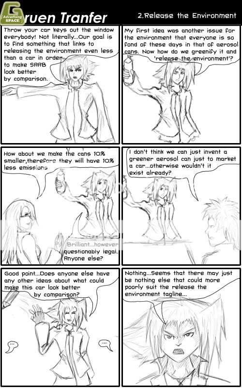
I got some free time over the week so I was able to do the comic in order to catch up. So here is the comic linking to the SAAB - Release the Environment ad review. So now hopefully the comics will be posted on a weekly basis and linking to the ad I have just broken down. I'm pretty happy with the style at the moment so I think I'll keep it. Onto the comic...
I sort of didn't want to be so cynical about the ad because I don't overly hate it...but it isn't that easy to write these things and I think I have actually tried to paint Tannie as a ruthless marketer so it sort of fits. I do enjoy writing this sort of stuff though because it starts with a very limited option and then it's up to me to try and find a way to take it and alter it in order to try and spin a new comic out of it that still maintains some sense of humour.
Any critique is encouraged so that I know if there's anything that needs improving on. Also it looks like I'll have to break down the Bonds ad this weekend. I don't know why you all want me to study girls in underpants but it's what you asked for so it's what you'll get :P I'm just proud to have more votes this week than last week. Although I don't have any new ads to poll for next week so if anyone has any suggestions let me know and it may just end up in the poll.
Anyway I hope you enjoyed this and hope you check in again to see what works so well about girls in underpants.
As some of you may know I am quite the avid comic maker. So in order to try and augment my blog I am trialing a comic to go with it. I am aiming to do one a week and try to link it to an ad that I have just broken down. I have been trialling styles and the such and so far I am pretty happy with where I'm at but as usual any critique is welcome in order to make it as good as can be.
This comic is simply introducing Tannie and also linking to the Cadbury Gorilla ad that I broke down just over a week ago. Anyway I hope you enjoy and as usual I look forward to any comments you have.
Hopefully I'll be able to keep to one a week, although since I am sort of a week behind linking to ad wise I may try and put a rush on doing a comic linking to the SAAB ad. This stuff is really hard to think about now that I've gotten started :P But none the less I hope you enjoy this attempted humours addition to the Gruen Transfer
I must admit I was incredibly surprised to see votes in my poll in the first day. I was honestly expecting to have none for the entire week, so you can probably imagine my surprise to get 7. With 4 of those 7 votes the SAAB - Release Me ad was the winner...You people never want the simple ones explained do you :P
Also just to point out I worked on a logo this week and the G you can see in the header above is just that. Also the G to the side is an edit on that to see if attaching the logo of the groups I critique adds anything. Any opinion on either is well encouraged. Also to those of you wondering what the 'advertising space' means. The basic point is that in this world it's sort of interesting to see that just to what limits advertising can reach. You think of it, and there's advertising on it. My incorporation of this into my logo is saying in my semi artsy wankery way is that even Gruen Transfers personal logo is not exempt from advertising other brands. The point that the core logo and recognizable feature of something can itself include advertising for something else. I hope I explained it well, if you're still confused just hit me up with a comment. Anyway onto Release Me.
Overall I believe this ad is sort of good, however it just went a bit askew. I believe the build up is good. It really gets the point of nature being contained and wanting to be released. It has simply one point it wants to put out and it points it out again and again to make sure it is understood without being intrusive. Personally I felt some of the images made me almost feel sad for it. Paritcularly the whale and the dog slow motion bits I found to be effective. The lyrics were also very powerful in hitting this point home. Now it may just be the site I took the lyrics from but these lines don't actually line up in the song, they are split up. So it was these lines being specifically chosen as compared to just choosing a part of the song. Here is the lyrics in case you didn't understand them all.
I am a rolling wave without the motion A glass of water longing for the ocean I am the fire burning desperately but you're controlling me Release me Release me
The fire burning line actually breaks in when the dog is trying to break free and I believe that is the power moment of the ad. I believe that if you don't get the message here you may not be paying as much attention when viewing the ad, which when you think about how people view ads could be a vast majority, thus they later bring in the line across the screen that points it out especially that the power of nature wishes to be free. I really think up to this point the ad has worked really really well. Up to here I am really impressed...then the car appears.
I have to admit linking the car to this theme of releasing nature is a hard one, and I personally cannot think of how to do it better, however perhaps it needs to be said that perhaps it wasn't the time for this sort of campaign. I believe that it is too early into the environmentally friendly car campaigns. When I link cars to the environment I think it's negative...and I think many others would do the same. Thus when you talk about releasing the environment, suddenly releasing something likely to destroy the environment doesn't really work. Sure it may destroy it less but at the moment cars in any form are still a negative on the carbon emission scale.
I believe this sort of campaign would better be saved for when environmentally efficient cars become a bigger market. At the moment I don't personally know many people who would be in SAAB's target market, but I imagine the people who have the money to throw at something as swish as a SAAB car would be the type of person who sacrifices everything else to propel themselves forward and because of this if they offer a model like this and then a normal car with perhaps a fancy gps attached then the GPS will probably win. Odds are that this SAAB probably has a GPS already but the basic point is that I believe most people in the target market would consider the environmentally friendlier features to simply be inline with the sort of gimicky yet useful features and not exactly a top tier one at that.
Personally now whenever I look at the ad and I just see the car coming out to the line 'release me' I just think in my head 'I can't believe you've done this'. It really did have potential, and it is a really good ad, but just the environmentally friendly transition to car is too before its time. I believe it would be misinterpreted as egotistical simply because of how it's trying to compare the car to nature itself.
One other thing that caught my interest is the bhp line. I asked around and it turns out very few people even know what this means. This is the one line they're using to promote the cars features and they chose to say something that cannot be understood by everyone. What I interpreted from researching is that it stands for is actually Brake Horse Power and it stands for the power provided to the steering wheel if you ignore the non-necessary elements such as power steering. So overall the message they're saying is it's a powerful enviro friendly car. It's gotten across but just not as effective as possible. Another ad that says the same thing is the ad with one guy with a slurpee that goes 'We can't all drive fast cars'. Personally I don't remember the car in particular in that ad, however if I were in the market I think that would be more effective since it got the message across more clearly and while incorparting a good laugh.
Anyway that's probably all I have to say about this ad at the moment. But I hope you gained something from it. I shall be starting the new poll for this week shortly. The competing ads are Cadbury's Trucks, Honda's CRV, The Big Ad and Bonds Hi and Lo.
Since the Gruen Transfer has now ended I have no choice but to start using actual real adverts for my breakdowns. So it now comes down to actually critiquing stuff for what it is rather than breaking down something that at its root is more about humour than real marketing.
In order to celebrate this glorious transfer I have decided to critique this years winner of the D&AD's Creative Advertisement adward for Film and TV. From talking with a few people about it, it appeared that many people were simply perplexed as to why it won. So without further ado I shall explain as to why I think this ad was deserving.
Cadbury - Gorilla
First of all I would like to point out that it won a 'creative advertising' award. So overall the creativity is what is important. Marketers love new innovative ways to do things. So just first off you have to realize that winning this doesn't exactly transfer into 'This was the most effective/profitable ad of the year'.
The first bit of the ad I would like to discuss is the initial tagline 'A glass and a half productions'. I haven't seen this line used before as a direct tagline for cadbury so I believe that the actual intent of this ad was actually to launch this line. Now for those of you not marketing inclined, a line can be quite important. Easily important enough to create an advert like this for. When you break down that line the root message you're meant to get is that there is a glass and a half of milk inside cadbury. Now the obvious connotation here is that milk is good for you, it's healthy and it's also often something people don't get enough of. At the core of it all, what it is basically pointing out is 'Get your daily serving of milk from cadbury'. The indirectness of it works. Because if that line was simply thrown at you, you'd be pretty skeptical about it. However this single line leaves all the conclusions for you to draw. I also find it brilliant they didn't have to even use the company name, they simply attached the milk logo that cadbury uses to reinforce the line. So before the ad has technically even started you could see the message, think that perhaps you need more milk in your diet and that cadbury is a source of this all without the negativity that comes from being directly told such things.
That was one hefty paragaph for one line...Anyway on with the show. I'm not sure how many of you know but Cadbury actually has copyrighted the shade of purple that it uses. So if you're wondering why the gorilla is in front of such an odd colour, it is simply because Cadbury is showing off it's special own colour.
The way the start of the ad works is because first of all you're confused as to why is there a gorilla close up...What relevance is this to anything? Well one of the beauties I find in this is that it isn't really relevant at all. It keeps you guessing and it gets you talking about the ad and one of the most powerful marketing methods is viral marketing via word of mouth. One person mentions it to a few people, then those people spread it on. Then all of a sudden heaps of people know about it. I know I had a go at one of the Gruen ads for not using relevance to the topic at hand but I just believe this ad has handeled it so well. It's the kind of ad if you hear about it you have to see it, and when you watch it you get the cadbury tagline. It is awesome advertising simply because you're getting other people to do it for you without being charged.
The start of the ad is simply setting the scene. The music starts complacent, the gorilla looks complacent. It really starts to make you think that this gorilla is calm and not going to really do much at all, and of course all the while inside your head you're still going '...wtf?'. Music used in advertisements can cost absolutely heaps, it could have easily been the hugest expense in the creation of this ad to get just that song so you can see that it was specially chosen. The reason I find it perfect is that it starts out calm, and then the drums come in. However even after that, whilst the Gorilla gives you the sense of the song really getting into it, the sense of calm hangs around because it is still in the song despite the drums coming in.
Then all of a sudden drums appear and then the gorilla just gets into it. I must admit I laughed, harder than I can remember ever laughing at an ad, I thought it just brilliant because it was so shocking since they had just set the gorilla up to seem so calm. I'm not sure about others but this is really the kind of ad that I'd want to look for on youtube and tell others to look for simply because of how funny I found it. So there's another avenue of viral marketing taking place.
Finally the cadbury bit shows up, and even this I enjoy, because it is calm and still fits in with the music which I earlier described to hold onto that calm element. There's no talking over it, no prices, nothing invasive. Just a picture of the product and that same tagline again.
So overall I find this ad to majoritively be about the launch of the new tagline, the glass and a half of joy. The beauty is in that it's not telling you to go out and buy it. It is simply increasing your perception of the product which is perfect for chocolate because it is an item you cannot avoid in your daily life. Chocolate does not need ads to tell you to go out and buy it. It needs to increase your perception of its worth so that when it comes down to say in the supermarket where you're at the checkout faced with chocolate, you think 'Hey this has milk in it, I haven't had much milk today'.
I love this ad, I just find it to work on so many levels. I really hope I have explained them here well enough so that you all can understand why it was deserving of an award. As usual comments are all too welcome and if you liked this be sure to click the rss subscribe thing so you can get updates.
With the Gruen Transfer coming to an end I fgured it was only fair to finish off by critiquing the final pitch. The almost impossible pitch this time was to make an anti tourism plan for Australia.
Pitch 1 By Grey Worldwide
Overall all I have to say to this ad is that I really am disappointed in it. This is meant to be experts putting out awesome effective advertisements. However what I see here is a failure with only one semi redeeming moment being that in the humour of the demigod comment.
It is not simple a single reason as to why I find this to be an ineffective ad and because of this I shall break up each bit and explain them separately. The first aspect is that it takes too long saying how great Australia is before getting into the actual point. It's 40 seconds in before they actually turn it around to their main point. If this were a real advertisement then you face the issue of people only getting half of the message and then leaving the room. Despite the fact that the advert has not been effective enough to maintain your full attention it is still possible for you to retain part of the message you did receive. Thus it is possible that in certain cases this ad would have an adverse effect .
The other part I have an issue with is that it directly insults the intended target. The spokesperson for the ad said it tried to play on insecurities yet this is obviously too far past the line of acceptable which would make all people who were the intended target and actually saw to the end would grow angry at the endorser. Now there is one issue here. You're encouraging anti-tourism...so who do you get angry at? Who benefits from such a thing? Although however this may be considered irrelevant because it all basically boils down to if someone pisses you off you are inclined to do the opposite of what they say. With just how beautiful the first half made Australia you may just go and do it even though without the ad you may have not considered it.
So overall my opinion is that the first half is a failure and so is the second half.
Pitch 2 - The Glue Society
I am much more pleased with this ad overall. Even though this group utilize the same sort of build up and then hit you with insecurity, they manage to do it so much better and thus make it work. Thus proving that an idea itself may not be bad, it could just be in the action of said idea.
The play on insecurity is perfect. It isn't insulting at the slightest, it is simply stating a fact. Yet it is the perfect fact. Big open spaces. The obvious fear tourists face is getting lost. The fear in getting lost of course it what could happen when you get lost, and in that fear death is always the scariest bit. It has set you up for exactly that line to scare you out of Australia and if I didn't live here myself I'd probably be scared too.
If this were on normal tv it would be perfect. This is because once you've seen it then you'd be looking at the ad with new eyes for every next repeat viewing. Every scene you'd look at and notice little aspects and be like 'Wow, a body could easily go in there! 0.0;'. Now this does sound horrible, but the thing is this all happens in your head where you're much more susceptible to such thoughts without blaming the ad for going too far.
I do love the final line though. It is incredibly witty to use the line that Australia itself used unsuccessfully. Then the inclusion of the final word 'buried?' hits you back to the point at hand. If anything I think it would be incredibly effective as a scare campaign.
Now it almost goes without saying that I'd have to pick No 2 as the winner personally. The Gruen panel also chose the Glue Societies entry which makes me feel that I'm not 100% talking out of my arse here.
Unfortunately this weeks was the last Gruen Transfer episode of this series so it will be a while before I can critique any more pitches. I'll have to actually resort to real ads. In the final episode the ad of the year was also revealed in that of Gorilla by Cadbury. I really like the ad myself. I'd explain it but I'm actually tempted to critique it so I may just save it for another post.
Anyway I hope you all enjoyed this post and if you have any comments feel free to post them
I've been itching to have my first go at critiquing and advertisement and many people have been helpful with having quite a few options. However in the spirit of the Gruen Transfer I figured why not do a Gruen ad. More importantly the ads that are shown in 'The Pitch'.
For those of you who are unaware of what the Pitch is, is is a part of the ABC television show that shares a name with this blog where two marketing corporations go head to head to promote something a little outside the norm. For the episode airing the 23rd of July, the challenge was to promote International Buy Nothing Day. Without further ado I'll move onto the entries.
Entry 1 by Brain Surgery
Now before I get started I'd like to point out that it is apparent that both of these ads are designed to entertain as opposed to directly promote something. In that respect they can't directly be compared to normal advertisements. This is most predominant in the fact that swearing is allowed. I'm sure a few of you remember the adverts for panty liners that recently aired and caused a huge uproar because it featured a beaver as an analogy for the god forbidden V word which is not allowed to be acknowledged as even existing. However I shall not delve further into that, since that ad in itself is one that probably deserves its own post. My point however is that ads by nature must be very tame.
As an ad I am actually impressed with this one for the most part. It has a powerful build up in the sense that it is one of those ads that pulls you in and makes you think 'What could this possibly be for?'. This is a very effective inclusion in an ad because it makes the audience pay attention because it has built up this suspense of what is coming and by nature humans are curious. Even though the ad was announced that it would be for International buy nothing day I still had no idea what was coming up when I first watched and because of that I am impressed.
However while humourous I do disagree with the need for swearing. Whilst it is not out of the rules, I personally prefer if you're trying to make an ad for something to actually follow the rules of advertisements and acknowledge the things that if it were a real ad, what would be pulled off.
One major bad thing I do have to say though is that the connection between the scene and the 'International Buy nothing Day' theme was not established enough. There was just some link missing after such a wonderful buildup. Therefore the ad them seems to be broken down to two parts which is simply funny bit and then separately a small ad tagline while your attention is still kept from viewing the earlier funny bit. This method works, however is less effective because consumers are less susceptable to messages that are obviously direct advertising.
To fix this problem I would have recommended putting in a tagline such as 'Too Much Stimulation?' thus relating the final part to the initial bit. Personally I believe that may have well been the underlying message but with advertising bluntness can often pay off.
Now onto entry 2 by The Cavalry
I found this ad to be less impressive overall. On last weeks Gruen they actually pointed out that these ads are overall somewhat effective for the small outlay of money that they require but overall don't do much from a marketing perspective. All it does is simply yell messages at you hoping you will absorb them like a sponge. Seeing an ad like this on TV can often be annoying, however this one has the annoying element masked on the grounds there is humour used. But even the humour wears this since it is basically beating the same idea for as many short snippets as they can. It works on a first watching, however if you were to see this ad multiple times, as you would if it were on TV, the humour would wear out and you'd be left with your basic yelling advert.
That being said I don't have just bad things to say about this ad. I think they had a brilliant interpretation. Marketing works best when you think outside the box and they reinterpreteded 'buy nothing' quite succesfully. I just think perhaps they could have gone about it better.
The panel of judges ended up voting 2v2 so on the show these two ads met a stalemate and therefore there was no victor. However the Gruen Transfer has an option on their website to vote for the advertisements themselves and have your own say. Personally my view is that the first ad was the superior one because it caught the consumers attention and therefore brought the consumer to the information they desired to get out while the second ad simply shot all the information it had at you and hoped you absorbed enough to get the message.
Now that's my wrap of the two advertisements in this weeks 'The Pitch'. For those of you wishing to catch the Gruen Transfer, this week is its final week. It airs at 9PM on the ABC on Wednesday nights. This week should see the announcement of who has won consumers revenge, which is where viewers of the show had the change to make their own ads for Gruen Beer, Gruen Beauty and Gruen Bank. Depending on how this turns out I may just try to critiquie those ads as well. Anyway thankyou for the read and I hope you gained some knowledge or got some enjoyment out of this.
Welcome to the Gruen Transfer. I created this blog in order to further my marketing knowledge by attempting on a weekly basis to analyze an advertisement I have found and try and break down on what levels it does and does not work.
Now I'm sure the obvious point here is 'Isn't the show on the ABC with the same name doing the exact same thing except that they know what they're doing?'. Well...yes. However in the process of coming up with a name there was simply nothing I could come up with that would be as suiting as the Gruen Transfer. Now one thing I'm sure few of you are aware of is what the Gruen Transfer actually means. It isn't just the name for a show it is actually a marketing term. Here's a wikipedia exert that I find to describe it best.
In shopping mall design, the Gruen transfer refers to the moment when consumers respond to “scripted disorientation” cues in the environment. It is named for Austrian architect Victor Gruen (who disavowed such manipulative techniques) and lately popularized by Douglas Rushkoff.
Now for those of you who don't exactly understand what this all means the basic jist is that when shopping and all of a sudden you move from your initial purpose, eg. Buying only bread, and move into considering other products, eg. Chocolate that has been placed on the end of an isle. This sudden snap into impulse buying as created by your surroundings is the Gruen Transfer.
For a site critiquing advertisements I believe this term is a perfect name since advertisements are so intertwined with this process. A perfect example of this would be chocolate advertisements. A chocolate advert may make you desire for chocolate, however in reality very few people will see a chocolate advert and head out however far it requires in order to obtain it. The true value is in when you head out for a staple good such as bread and then notice the chocolate and, for the most part subconsciously, remember just how much you wanted chocolate after viewing the advert and then consider purchasing it as to satisfy that desire.
Now one of the most important things about critiquing marketing is that it is completely subjective. One person may say something does not work for one reason and then the next may say it works for exactly that reason. The main point I have created this is to further my knowledge and the best way to do that is to get comments myself. There is nothing that would make me happier than seeing a 'But have you considered this?'
Anyway I hope you all see some merit to all of this and hope that overall everyone has something to gain from this blog. Now in order to start critiquing ads first of all I will need ads to analyze. I could just go picking whichever ones catch my eye however I would much rather be critiquing those that you all find puzzling so as to be aiding others. So if any of you have any advertising campaings you would like to see critiqued then simply add a comment to say so or email me.
Thankyou for your time and I hope you gained something from this.
Michael Lanyon is currently a 3rd year Marketing and Management student at the University of Melbourne. His main interest is in branding and is currently volunteering as brand Manager and Promotional leader for Melbourne Anime Festival Inc.


 I must admit I was incredibly surprised to see votes in my poll in the first day. I was honestly expecting to have none for the entire week, so you can probably imagine my surprise to get 7. With 4 of those 7 votes the SAAB - Release Me ad was the winner...You people never want the simple ones explained do you :P